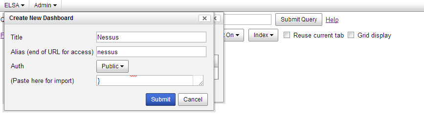
After you have downloaded and saved off nessus_dasboard.txt from my Gitub repo you will want to import it into ELSA. To do this, open up the nessus_dashboard.txt text file and copy all of the text in it (Ctrl-A). Next, from the ELSA console click the ELSA menu button in the top left and select Dashboards.


Next I have a pie chart that shows the count of vulnerabilities by severity. In the Nessus world severity is determined by CVSS score. Severity 3 is the highest and 0 is the lowest. This maybe a bug or more likely I did something wrong, but I could not get my title to show on this pie chart. If anyone knows how to fix this please let me know. In the chart below you see that the most common severity is 1 (blue) followed by 3 (red), 0 (green) and 2 (orange).

Directly below the pie chart is an area graph that shows high severity Adobe Reader vulnerabilities by host IP address. Similar concept below it but this time it is a bar chart for Oracle Java vulnerabilities. Notice how when you hover over each bar or column the host IP address shows up. This can be helpful if you have a lot of hosts.

A couple things to note here. I have a single query per chart. There is nothing stopping you from including multiple queries on one chart as long as they have the same 'groupby:' parameter. It might make sense to do a single chart with multiple third party vulnerabilities graphed on it. You can accomplish this when you edit the charts by adding another query. I have an example of how this might look.

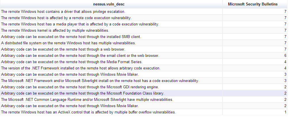
On the ELSA wiki Martin calls out a table chart that is somewhat hidden among the 'More' category when selecting chart types. This table works well if you have if you have a lot of text to display. I have created a table chart below that lists high severity Microsoft Security Bulletins, their associated short summary and their frequency.
Finally, I saved the coolest chart type for last; the gauge chart. This chart is really only practical when the 'groupby' category of your query has less then 10 items. Anymore then that and it is very difficult to see the gauges. Unfortunately, I may have run into the same bug as the pie chart above because this chart also will not show its title. Again, if you know why please let me know and I will get it fixed. CVSS Base score can be a helpful indicator of a vulnerability severity. Nessus also provides a helpful field on whether there is a public exploit available. The gauges below list the number of vulnerabilities with a high severity rating (CVSS Base > 7) and a public exploit available grouped by Nessus ID. The areas of green, orange and red on the gauge can be dynamically assigned to values of your choosing. Very cool stuff.

Feel free to experiment and if you have any good suggestions I would love to hear about them. Check back on my Github account. I will post a similar dashboard soon that goes with my OpenVAS class.


